Showing posts with label Blue. Show all posts

Monday, May 26, 2014

Tetris drafts

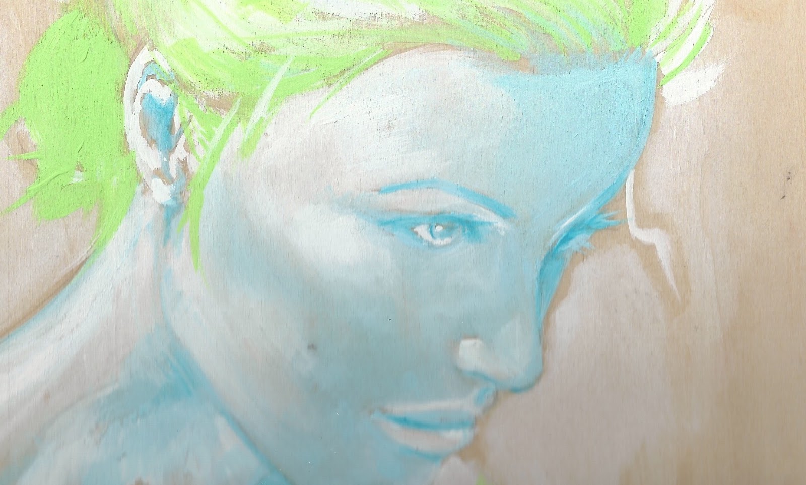
This week is kinda heavy work wise - takin a few tubes of paint and piece of board with me is all I got.


Thinking that having a few blocks on the ground would be the best way to merge the real with the unreal.

Saturday, September 14, 2013

Sonic stop-ani

Step by step the running animation is getting closer to completion.


I hadn't realized what a huge task it would be, but keeping it as a side piece is helping keep the momentum.


Roughly each cell costs about 2500 yen "/


Sunday, August 11, 2013

Blue Pixels

Working on acrylics is going well enough, so it seemed time to try something new.


Using these wooden cubes, avaialable at Tokyu Hands, I'm wanting to create an animation of sonic the hedgehog. Sounds far fetched but it'll definitely keep me on my toes.


Wednesday, July 31, 2013

Pixel Collision

If cubes become the focus for the next batch of work, light is going to play an integral role in bringing the piece to life.

A4 - Wood / Acrylics

Cubes themselves are simple to sketch, but ultimately boring without attention to lighting.

A4 - Wood / Acrylics
Harshly illuminating one area created some interesting ideas.

Sunday, July 28, 2013

Tonal Testing

Working with pastel green allowed for some accurate textures. Although I couldn't quite get what I was looking for, think I might've screwed up with the sketch in the first place.


Monday, June 3, 2013

Sekaido - 2013

2013 entry - F3 canvas / Acrylics

Initially setting out for a bugs-eye-view visual, missed the mark a fair bit. With a few more hours I'd like to have darken the women's facial contours a little, as the light against dark backdrop was a little harsh. But all in all, scaling up on last years work, creating 2 pieces on a right deadline, it didn't turn out half bad!

2012 entry - F2 canvas / Acrylics

Sekaido work - week deadline


The previous canvas debacle left me with just 7 days to create a new piece in time for the exhibit. Recreating the same visual on a smaller canvas would've been much simpler but where's the fun in that.


Time restraints led to a limited pallet, meaning black would be taken out of the equation. Initially I wanted a more vibrant bubbly piece anyway since the last had been pretty morbid.


The yellow sky was a base layer to motivate a lighter mood whilst working, but eventually needed to be darkened to balance the shading on the plants.


Tuesday, April 2, 2013

Pixels!

I've had pixels on the brain the past few weeks.


Not too bad for a first try, squares themselves don't lend themselves to interesting textures, but I've got a few ideas in mind for the next piece.   


Thursday, March 28, 2013

Testing the water

My wife is pretty awesome, but I've never been able to capture her character in my work.


Layering thin films of acrylics might have been the wrong choice. Its's safer but the final result isn't satisfying.


Think the next portrait see a return of thick acrylics. Safe isn't getting results.

Saturday, March 23, 2013

Speed Acrylics


Not happy with the actual result, but the main thing is to learn and take forward. originally I was thinking the composition with the sketch wasn't too bad.


Looking back, the eyes could've been better. Symmetry is once again the monkey in my soup.


Shiva

The Shiva painting a few weeks back pulled me out of a slump I'd been in for a while. It only seemed right to take another shot at her, but on a larger canvas.


The composition is a little off, but hey, the eyes came out pretty well.


Saturday, March 2, 2013

Shiva

2 hour portrait sketch.


Really love the cheek bone definition on this painting. Using a light acrylic and layering from light to dark seems to be working for me.


The underlaying texture and natural pattern of the wood underneath the painting are perfect for skin tones.

Sunday, February 3, 2013

Peel

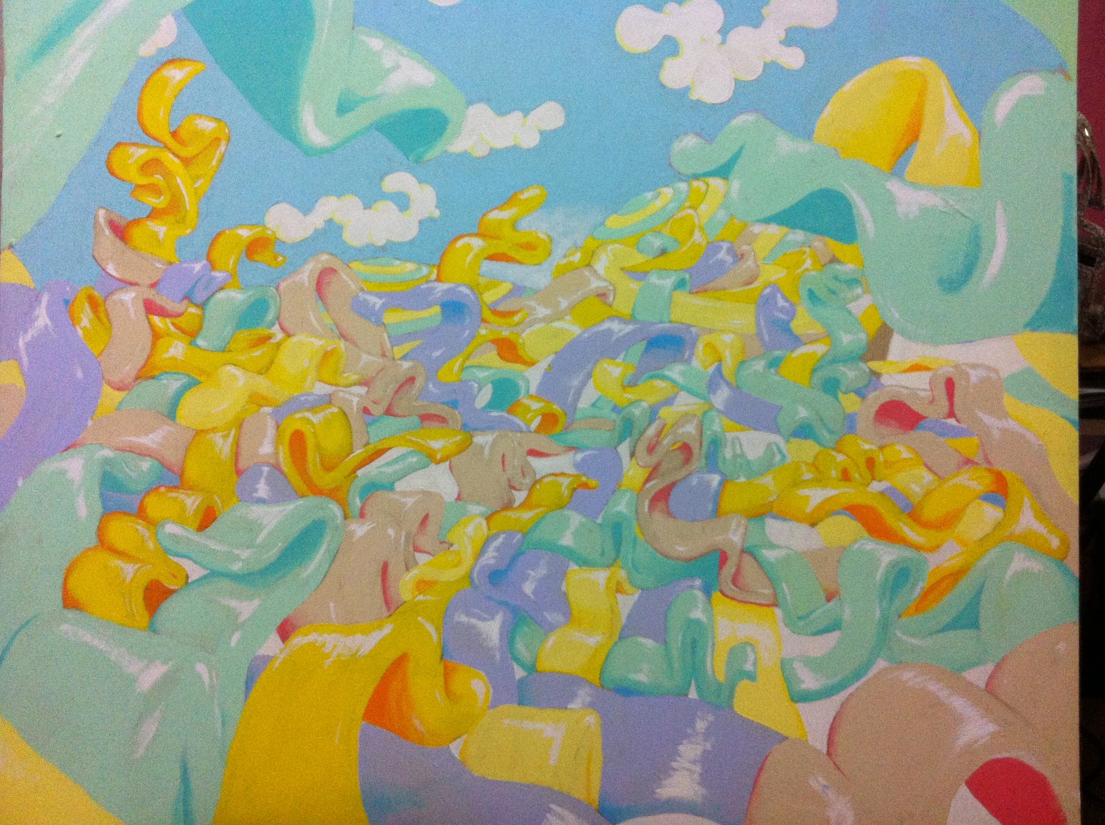
Messing around with the clay earlier this week lead back to some Planet Peel visuals.


After a few months of working on portraits, animals and plants it was about time to go back and see what could be done with the Planet Peel visuals. 


Overwhelmingly these visuals give me a sense of satisfaction unlike the portraits. The ribbon effect is just a bunch of fun, so I'll be spending the next week working on new ides, colours and expanding the world a little.


Sunday, January 6, 2013

Gold Ring

A4 wood - Acrylics / pencils

It'd been a while since I'd last tried a portrait and felt this worked our pretty well.


Although this took a little over 2 hours, I'd made the mistake of thinking her eyes would balance naturally. The left side of her face is exactly what I was looking for.. The right side, not so much. 


Planet Peel - Drafting

A3 Pad - Acylics / Oils

Just a rough draft testing different stroke techniques. 


The "PP" visuals had all been quite smooth, which is nice, but too simple. To really connect and believe in this environment there needs to be texture and emotion.


Sekkaido - 2012

F20 wood - Acrylics

I was pretty content with the final piece. It's no Matisse but for a first attempt I was satisfied.


I'd gotten wind of the competition 2 weeks prior to the deadline and so needed to work fast. Choosing an F20 format and a limited pallet would cut costs and save time.


Following the theme of "Planet Peel" I looked for vibrancy and movement and also immersion which foreground and background action.


If I'd had more time before the deadlines I'd have spent more time on the pencilling, as looking back, there needed to be other elements such as flowers or insects to make the context clear.

Planet Peel - Concept

A4 wood - Acrylics

As a kid, Doug TenNapel (creator of Earthworm Jim and Neverhood) had a big influence on me. The "planet peel" concept comes from many places, but the kind of vibrancy and creativity of the EWJ series has a lot of bearing on this type of work.